Here is a brief introduction to some of the things we do with different data. Buckle up readers, this may get a little geeky! But it’s really not that bad – follow the steps and let’s work through it together!
Let’s say a business has a data set (what business doesn’t!). One way to start to look for information in the data set is to use an algorithm to put the data into groups, and then to compare the points in each of the groups and see what makes them fall into a group. Then, look at the groups and figure out what’s different. You’re suddenly able to understand something bigger about the data…
A classic example of this is a tee-shirt manufacturer. Let’s say that this company is starting to do business in North America, and they want to figure out the general categories for tee-shirts in sizes Small, Medium and Large. Surveying a bunch of people and plotting the results of their weight vs. height on a graph gives us a picture of the size of the population (assuming you have an appropriate statistical sampling method). Our example company can now use that population sample, and break them into 3 groups so they’re able to design shirts to fit those three groups.
One of the grouping algorithms out there is called a “K-means” algorithm. If you think about a group of 2 dimensional points (with an x and y coordinate – easily visualized on a graph), k-means is fairly easy to describe: we’re going to randomly place “centroid” points on the graph, figure out which of the data points belong to each centroid by calculating the distance between the data point and centroid point – a data point belongs to the closest centroid. Once we visit all of the data points and figure out which centroid they’re closest to, we then calculate the NEW center point of each centroid based on all of the data points that belong to it (the average of all of the data points). This effectively moves the centroid to the geometric center of all the points which belong to that centroid. We the iterate this process – calculate which points are closest to which centroids now that the centroid moved, then re-calculate the centroid, etc – over-and-over again until the centroids no longer move, and we’re done.
A pretty simple algorithm, right?
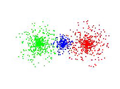
Let’s say that we have a data set that looks like this:
I’ve specifically colour coded these clouds of data points to show you the three distinct groups in it, as they come from three distinct process variables (a technical way of saying that there are three different contributing factors to the whole group of points). Notice that the interfaces between the clouds are blurred. There are blue points surrounded by green points, and the same with the blue/red interface line – it is blurred.
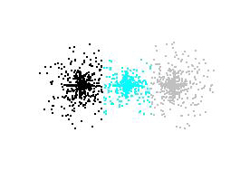
We now want to understand if the k-means algorithm can pick out the three groups. If we run our k-means algorithm and get to the point where it settles out and the centroids stop changing (8 steps based on where we’ve randomly placed the centroids to start with on this data set), we get the following:
Things to notice: the interface between the black and cyan groups is a very straight line from the top to bottom – same with the cyan to grey groups. Data points that originally belonged to the black group at the top and bottom of the black/cyan interface line, have now been trapped by the cyan group.
Is there a way that we can get closer to a proper grouping?
We’ve done some thinking about this. What if we think about the size of the clouds groups much like the gravity of large bodies or planets? The bigger the planet/group, the more gravity it would have. When looking at a point and trying to decide if it belongs to the black group or the cyan group, can we apply a factoring to the “distance” measurement based on the current size of the cluster? Meaning that a bigger cluster would “pull” a data point away from a smaller cluster…
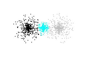
Applying this new “gravity weighting” thinking to the mix, our final results now look like this:
This gives us grouping results that are much closer to reality. We can now use this better grouping result to understand the groupings themselves.
When the data is related to height and weight measurements, it is easy to understand what the groups are telling us: what each size of tee-shirt should typically fit. When this data is related to sales of a particular product vs the yearly sales volumes done with the customer making the order, the groupings tell us something different.
These above examples are only 2-dimensional examples of data (ie. height vs weight). This type of analysis can be applied to many different points giving us multi-dimensional groupings. This where the power comes in!
Understanding the data that our customers have – weather it be sales, manufacturing process, failure rates, product inventory, etc – this is what we love and we continually strive to get better at.
Would it be useful to understand something more about your data by looking at how it is grouped?


I discovered your blog using google. I must I am floored by your blog. Keep up the good work.
Hi Gladys,
Thanks for your kind words, and for spending some time on our blog! If you’ve liked the last couple of posts, you’re going to love our upcoming 4 part series on The Healthy Barber!
Stay tuned!
Thanks,
Greg
This is mostly a really fantastic site publish, im delighted I stumbled upon it. Ill be back off the track to think about other posts that.
Thanks for your kind words and taking the time to comment!
Cheers,
Greg
Thank you for sharing excellent information. Your site is so cool. I’m impressed by the details that you have on this site. It reveals how nicely you understand this subject. Bookmarked this web page, will come back for extra articles. You, my pal, ROCK! I found just the information I already searched all over the place and just could not come across. What a great site.
Hi, just wanted to say i liked this article. it was practical. keep on posting.
It is really a great and useful piece of info. I’m happy that you shared this useful info with us. Please keep us up to date like this. Thanks for sharing.
Good post, I always like them.
I enjoyed this post; appreciate it for putting up.